So much of my copywriting overlaps with UX writing, and it makes sense. User-focused content that guides the audience where they need to go is top of mind in all of our web work at DigiPen. A few prominent examples:
Funding Your Education | DigiPen
View Full WebpageOh, the places you’ll go! Especially if you’re on the Financial Aid section of DigiPen’s website. Students, especially first-generation and international applicants, were getting overwhelmed, so we redesigned the Financial Aid landing page to streamline that starting point.
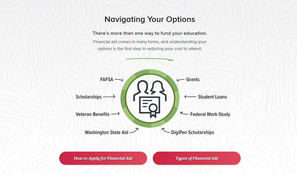
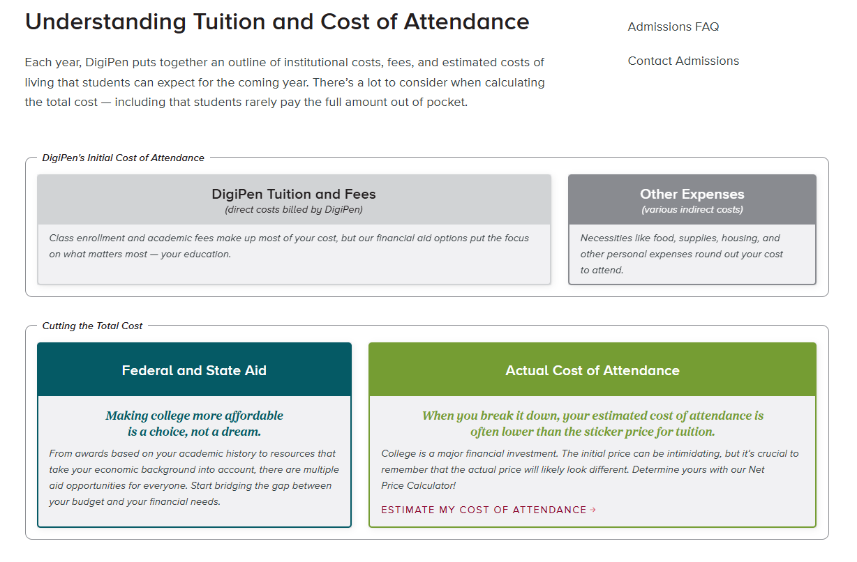
Easy-to-understand breakdowns with explanations that aren’t filled with financial aid jargon were essential. We provided answers for our students through the top-level page, which helped them know where they needed to go next.
Degree Program Pages Refresh | DigiPen
View Example Degree WebpageOur year-long project to completely revamp all ten of our degree program webpages was the culmination of months of user research and design tests. This page routes students to dozens of pages and resources, and each CTA along with where it’s placed was written with intention and purpose.
Some hyperlink text had to be direct and to the point, especially when the CTA was important to understanding page functionality. With other sections, like our list of companies alumni work at, allowed us to be more flexible with our tone and voice.

Home Page Features | DigiPen
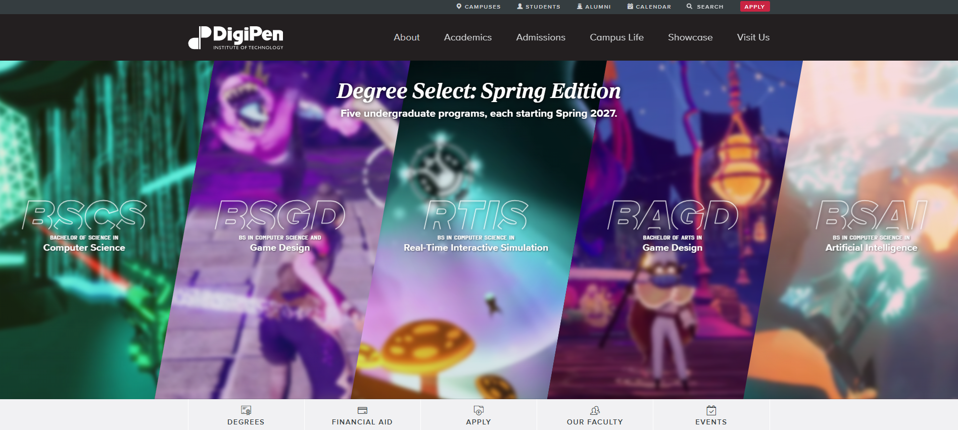
View Archived WebpageApplicants and prospective students were aware we had a Spring Start option, but they didn’t always know which degrees were available despite that information living on our Admissions pages. To remedy this, we ran homepage features to highlight these five programs. Our first feature gave equal footing to our list of degrees and our application opening announcement.
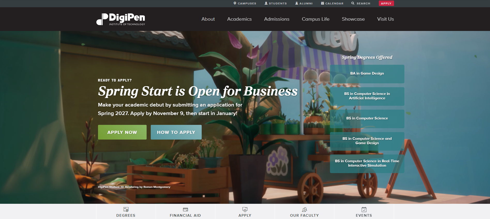
And our next feature was more flashy while emphasizing degree initialisms, something we learned students gravitate towards when making decisions on which program they want to apply to.